Plus Architecture’s Melbourne studio has recently relocated to a new space in the centre of Melbourne.
Taking ownership of a previously unoccupied, heritage building, Plus has invigorated the space, stripping the building back to its historical roots and then building upon these old bones, layering with modern accents and custom details, to create a new, workshop-style studio devoted to inspiring collaboration and creativity among the team. Whilst the team have spent some time away from the space due to COVID-19 restrictions, and there will be key design changes to ensure the studio meets the safety requirements when we’re allowed to return, Plus Melbourne are excited to share some images our new studio.
As a studio recognized for delivering responsible, impactful and meaningful designs built for real people, it was a no brainer that our studio space be designed with these principles at the fore. The designers embraced inspiration from design of previous projects across all sectors, from residential to hospitality, to create a commercial space which blurs the lines of a typical work environment and creates an engaging space for our staff, simultaneously seeking to evoke design creativity and nurture the strong, familial relationships of our tight-knit team.
Desiring a studio more reflective of recent growth, future aspirations and the rising calibre and scale of work now being produced, Plus Melbourne sought to relocate to different premises in a central city location. Synonymous with the ‘growing up’ of the studio – the new studio would be a reflection of Plus Melbourne’s status as a key player in the architectural and design industry. The idea was to create an office space which fully embodied the principles of Plus and demonstrated an immediate example of the high quality of design work that the studio is delivering.
“It’s a space that encourages participation, collaboration and creativity. The space inspires Plus Architecture to reach the new benchmark it has set for us all” – Ian Briggs, Director
Aesthetically, the designers looked outside of Australia and were inspired by the workshop style ateliers of New York and London. They desired a creative studio that could accommodate multiple purposes: serving both the company and the wider creative community as a space to display artists work, their own architecture and design, product designs, comfortably hold both company and industry events, and also provide a significant space for wellness activities.
Given the freedom to design our own studio space allowed Plus to really consider what, as a team, we needed to thrive as a company. Input from all staff was encouraged to create an inclusive design outcome, filled with spaces for connection and collaboration, reflective of our growth and ethos as a studio.
When Plus designers discovered what was to become their new studio, the space had been in a state of abandonment for over 40 years – surprising given its prime location on one of the busiest streets of central Melbourne. The building’s previous lives as a well-known book shop, printing factory and bank vault were unmistakable throughout – splashes of ink and great wounds marked the wooden floors. Through its stripped back and messy shell the designers saw considerable potential to create something wonderful from these old bones.
The reinvigoration of this boutique, heritage building initially saw the restoration of the base build to enable the space to once again become commercially viable. The original ceilings and floors were exposed throughout, bringing this beautiful old building’s personality to the fore once again.
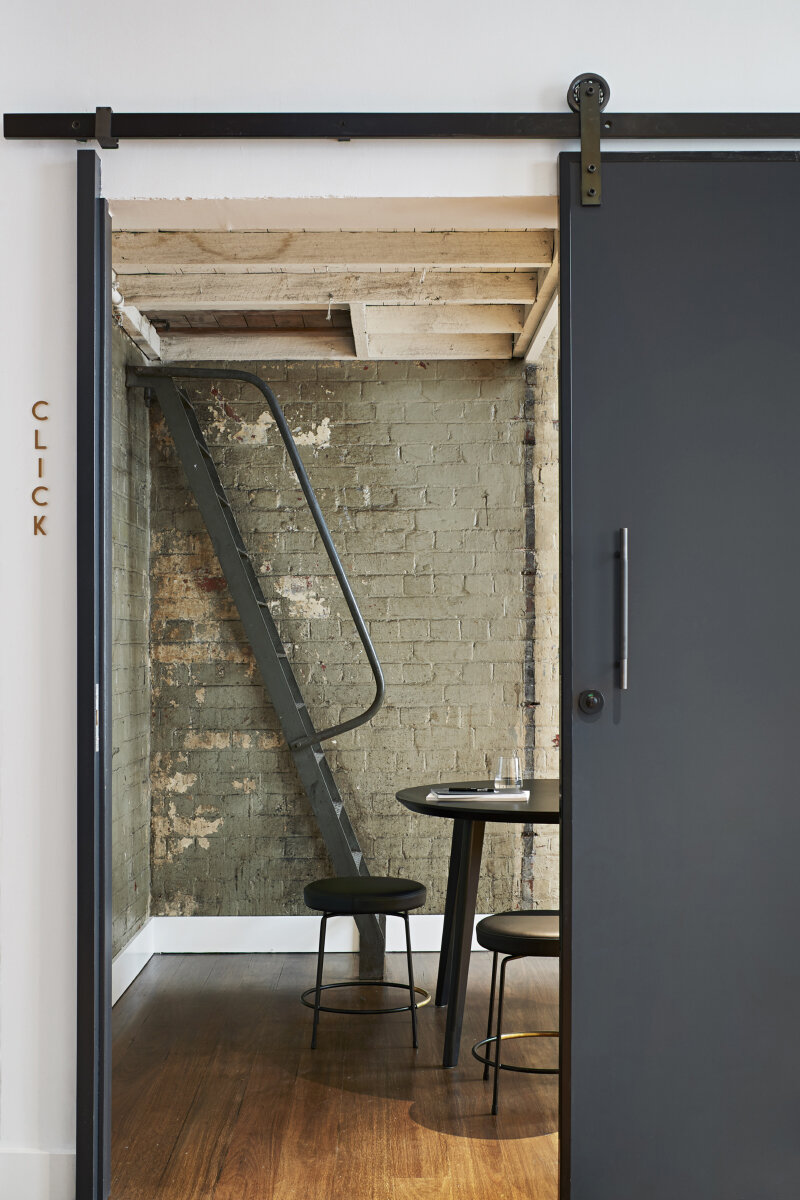
The essence of the design was exposing and celebrating the raw and messy parts of a beautiful old building and bringing this derelict and forgotten space into the future. Honouring the existing heritage elements and weaving these into the design throughout the space, juxtaposed against crisp contemporary additions created a space of interest and surprise.
The original brick walls were rediscovered, and the heritage wooden floors were restored throughout the space. Ink stains and vault marks on the floors were left in place as a reminder of the building’s interesting transition from printing factory to bank vault to design studio. The original lift shaft was reconfigured as an impressive new staircase, illuminated from above by a cleverly placed skylight.
The crisp material palette of tone on tone allows the original features of the building to sing – bringing a unique character to the space. The designers were mindful not to cover even perhaps the less desirable features of what was once a derelict building, choosing to celebrate them instead. Marks and graffiti on the walls from previous lives was retained, where appropriate, bringing moments of reflection and reminiscence for the working spaces of the past to this otherwise fully contemporary studio space.
The Reception: an ever-changing gallery wall – designed to showcase local artists work
A tribute to the many graffiti tags that once covered the walls, Plus chose to use this art form, also synonymous with the Melbourne-locale, as inspiration for the reception backdrop. The use of graffiti was juxtaposed with the seriousness and solidity of the custom designed reception desk – delivering a space that is truly unique and brave, unchartered design territory for a serious and professional design studio. Created by Melbourne-artist, RESIO, the display brings a surprising pop of colour to an otherwise minimalist, sophisticated space. The display wall behind the reception is envisaged as a gallery space, showcasing a rotation of local artists work and regularly updated throughout the year.
Adding a touch of whimsicality and playfulness to the design, the naming of each meeting room was inspired by the many graffiti tags covering the walls when the designers first visited the empty, unloved space. Another room, aptly named ‘Pigeon’, pays homage to the building’s main occupants immediately prior to Plus.
As signatories of the Architects Declare movement and committed to moving the studio towards being carbon neutral by the end of 2020, the design encompasses a strong focus on sustainability. Helping staff be as environmentally conscious at work as they may be at home, discreet recycling facilities are prevalent on all workable floors, all lights are motion sensored and the retained, large heritage buildings are openable, allowing the ambient temperature to be maintained, often without the use of air conditioning. End of trip facilities include bike storage, showers and staff lockers to encourage the use of sustainable forms of transport among staff.
The large spaces throughout the office can be configured to accommodate a number of different uses, offering both event space and wellness areas, fully flexible for staff to engage in yoga, Pilates and mindfulness or to collaborate on project work in large format with sophisticated technology. The studio is currently home to bi-weekly yoga classes – with the open, bright and naturally ventilated space offering a peaceful sanctuary from the surrounding busy city.
The spaces throughout were designed to be flexible, able to be configured for both internal and external events.
A human centric approach – how staff would actually be using the space – was central to the design concept and supports the Plus ethos of designing for real people. The overall space is inclusive and accessible for all with both lift and stair access and spacious passageways throughout. Given the tight heritage footprint, clever design and use of a light and bright materials palette opens the studio, crafting an inviting and engaging atmosphere that is welcoming for both staff and guests.
The studio features the latest in technology throughout – enabling staff to work remotely from anywhere in the office. Ambient background music drifts seamlessly across the floors, controlled by playlists created by the team.
Basic statistics:
Client: Plus Architecture Pty Ltd
Builder: Chroma Group
Photographer: Shannon McGrath
Size: 1330 sqm
Number of floors: 4 floors
In the space since: November 2019
Buildings former use: printing factory and bank vault


