Invicta House
Client | FinIdam
TYPE | Architecture, Interior Design, Documentation
SECTOR | Commercial, Workplace
STATUS | Design Development
Location | Melbourne, VIC
HEIGHT | 7 Storeys
SCALE | GFA: 4,501 sqm, Site 741 sqm
COST | CONFIDENTIAL
Renders | Plus Architecture
Reigniting a joyful sense of arrival
Located at 226 Flinders Lane, Invicta House is prominently perched on the corner of Flinders Lane and Swanston Street. If walls could talk, this building would have over 100 years of stories to tell. From a silk factory to a millennial backpackers, the classical detailed building has continued to mould to the hustle of Melbourne’s CBD.
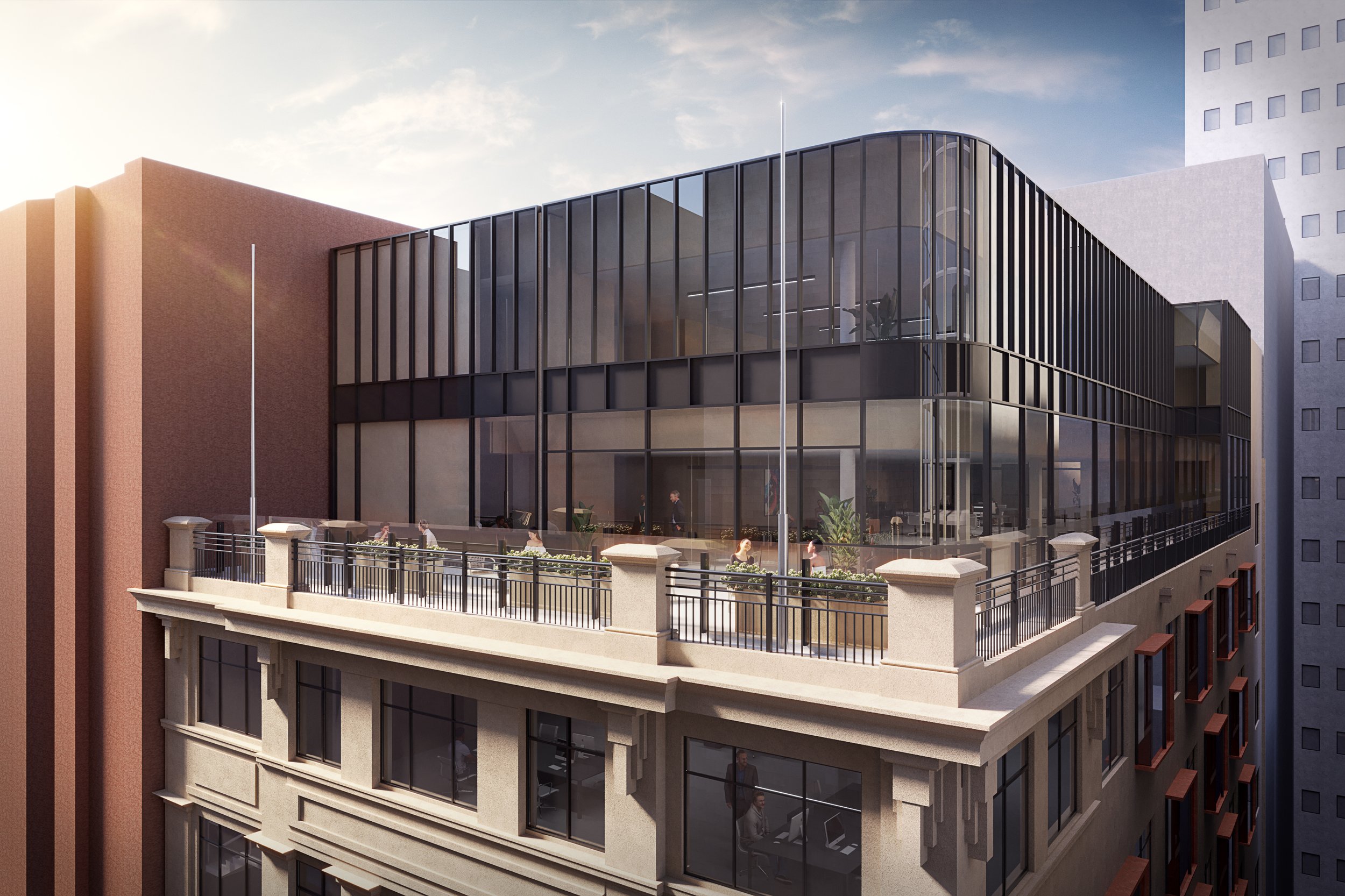
Owner of several commercial properties around Australia, our Swiss client’s vision was to see the sound structural, pre-world war two bones of the building restored to their former glory, though within a contemporary language. Thrilled with our work and collaborative approach to previous projects, we were briefed to design multiple functions into the site, including a restaurant in the basement, a commercial office amenity across seven stories, and a two-storey extension on top of the existing building to house a rooftop terrace. The extension needed to be incorporated respectfully towards the overall form of the building and the streetscape. Important to the client was the reinstatement of the clock attached to the façade, a characterful detail to act as a wayfinding beacon for those meandering within the laneway warren.
The visual concept, pays homage to the heritage context with the creation of a colonnade at the forefront of the street, opening the building and providing a welcome invite to pedestrians.
Yet, the most functional feat of our design is also a visual triumph — the staircase. The mixed-use nature of the destination created a challenge. We were tasked with providing three delineated paths of access from a central staircase: to the ground floor approximately 1.5m above street level, to the basement, and to the commercial lobby above. In one sculptural gesture, our staircase sits behind the colonnade delivering access simultaneously to all levels. Lift access has been incorporated into the overall form of the staircase.
At the heart of our design, the highly functional staircase is visually inspired by the silk trade that once relied on the site. Visible from the street, the curvature of the central arch interfaces with the glazed arcade of the Nicholas Building opposite. The ground floor ingress to the staircase, with the rhythm of its arched central opening, is enticing and evocative in its scale, creating a distinctive addition to the public laneway realm.
The façade is punctuated by thermally efficient, double-glazed windows. These bay-like windows cantilever slightly, immersing the occupants into the laneway context experientially, while also ushering daylight into the building.
The rooftop extension shifts design gears, recalling the essence of a modernist 1920s warehouse, robust in its structure. Intentionally, our rooftop borrows from two styles of the same era so that the extension complements the building below without mimicking it — a respectful nod to the original structure by the new. The rooftop offers a forecourt bathed in sunlight, for use by the occupants.
End of trip facilities embedded in the basement lends a relaxing and luxurious transition zone for workers. Cultivating a rich, spa-like experience for occupants reflects the client’s intention to attract tenants that will saviour working from the building long-term.
Invicta House epitomises the potential of design challenges to spur iconic contributions to the city’s fabric. A functional need to have multiple destination paths initiate from the same staircase, provoked an unconventional design solution. The result not only offers seamless access, but defines the identity of the building, setting it in place and cementing it as an enticing landmark that will visually connect pedestrians to the building now and into the future.


